Media Object Stable
Media objects help to layout repetitive components where content shouldn’t wrap around.
Structure

- Media data Mandatory
- Text Mandatory
Responsive Layout with a fixed image size
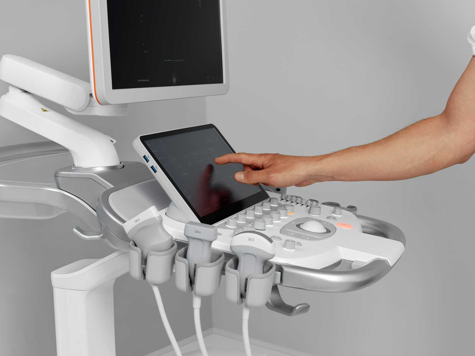
In contrast to a layout done with grid columns the image defines its size itself. The image has no responsive flexible size, so it stays the same size on all viewports. Instead of an image any media can be positioned alongside the text – that’s why it is called a media object.

Lorem ipsum dolor sit, amet consectetur adipisicing elit. Esse nihil possimus praesentium et neque omnis distinctio doloremque.
Small spacing mod
Since the image takes as much space as it needs, the media object can look different. With a small avatar image, it can be used, for example, for comments. The small-spacing modifier might be useful to reduce the margin between the image and body when the default gutter-sized margin seems too wide.
Reversed mod
The media object can be reversed to hold the image on the right. The source order should not be changed for this.
Stacked mod
The stacking modifier puts the image above the body on viewports smaller than the specified breakpoint. It is an uncommon behavior and should therefore be used carefully. Often, the grid columns are better suited to give more control over the responsive layout.
Dos and don’ts
- Do use the small-spacing modifier when using thumbnail images.
- Do check the resulting image size on all viewports.
- Do not stack media objects if a grid layout is what works best.
