Image Aspect Ratios
Image Aspect Ratios control image formats regardless of the source.
There are some common image formats used in digital design. In responsive design they are more like an aspect ratio for images regardless of the output size. Some UI-components desire a specific aspect ratio for images to display the content. If the uploaded image doesn’t fit the required format, it will be cropped automatically by the system.
When selecting an image, bear in mind that the uploaded image should be suitable for a variety of formats and viewports. The images should have the highest quality and largest size possible (images width of1,408 px or 1,920 px recommended).
Applicable aspect ratios
To apply image cropping in your code, you need to use the aspect ratio component.
Panorama
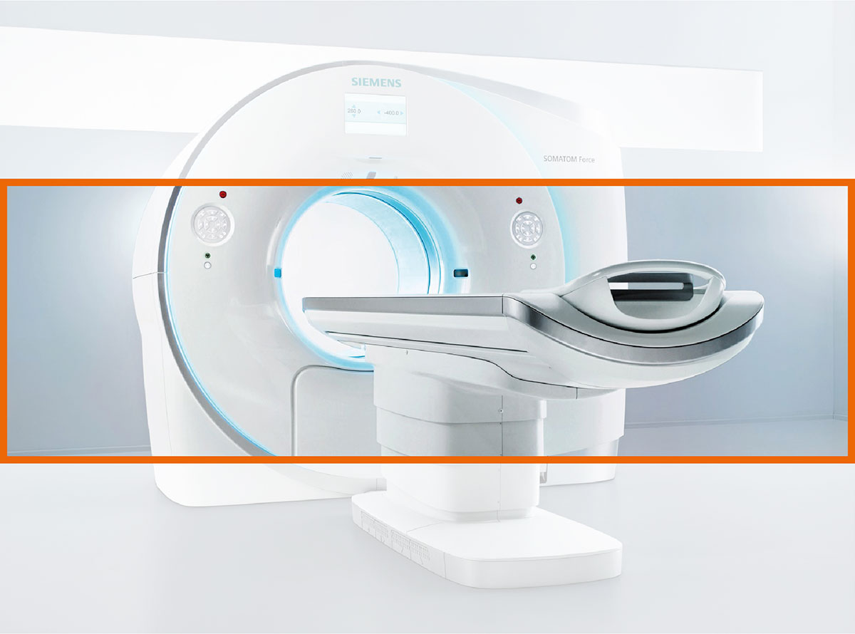
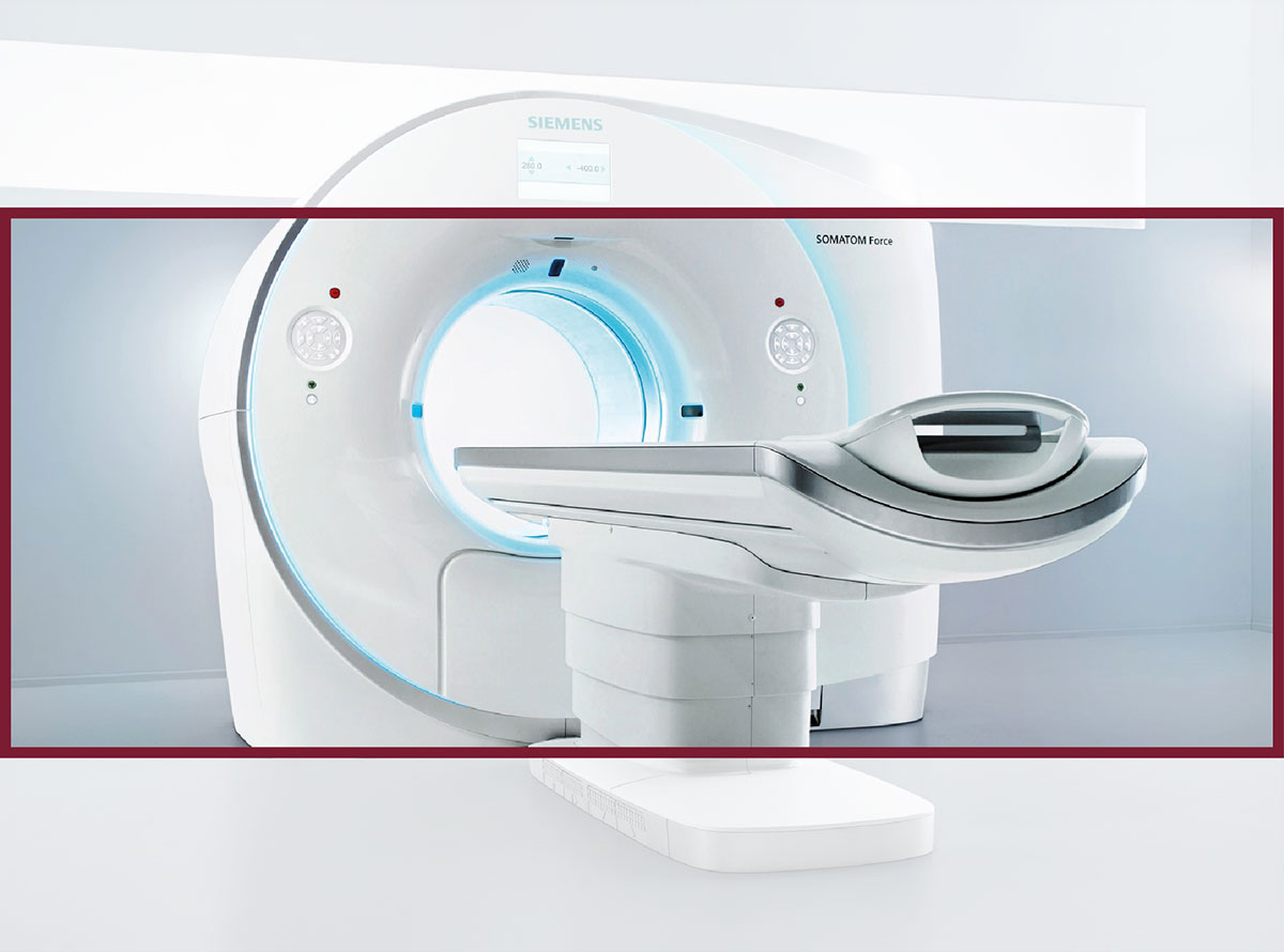
Landscape
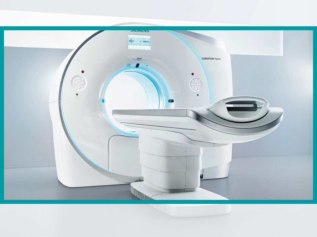
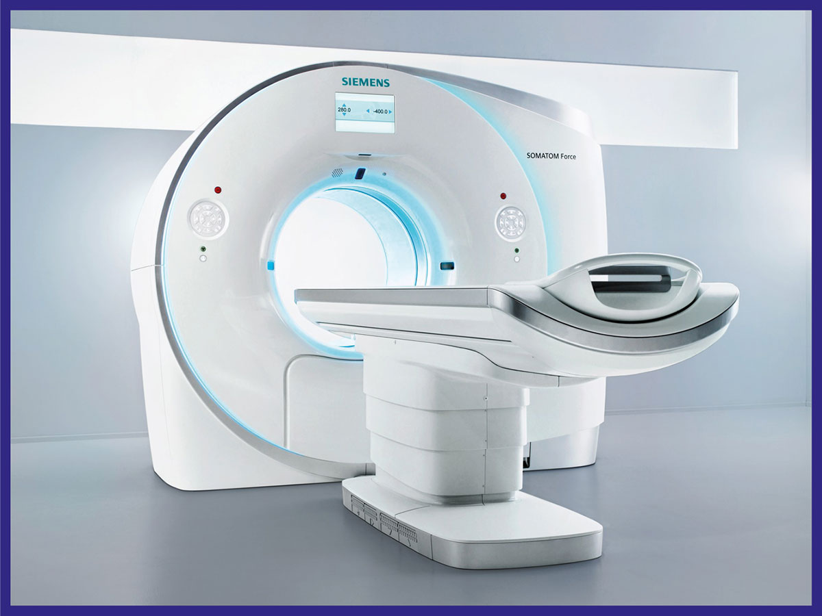
Square or circle

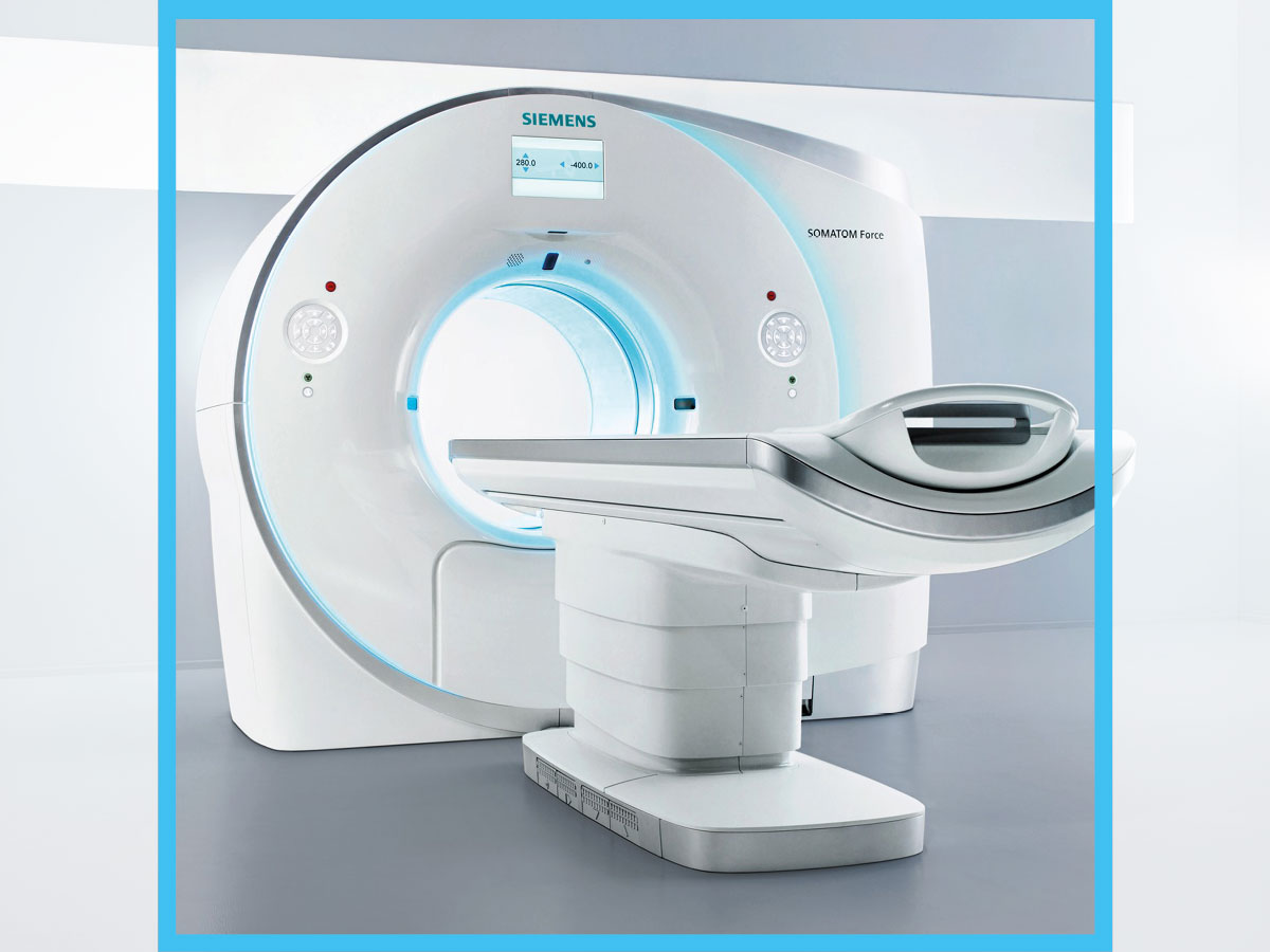
Portrait

Covered
The original image will be cropped horizontally or vertically whereby the motive is cut at the edges.
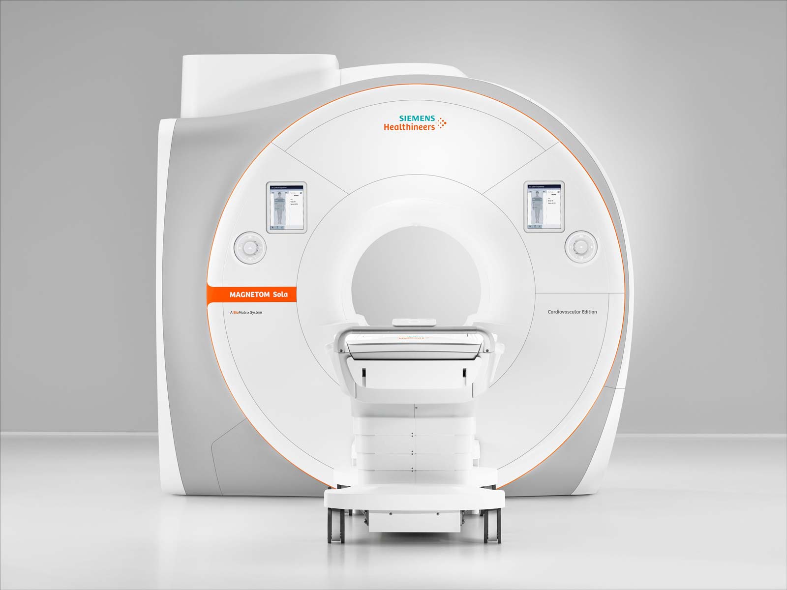
Contained
The original image format will be maintained without cropping, but it will be resized, and the pane of the aspect ratio will fill up the space.

Dos and don’ts
- Use keywords in image file names and alt tags.
- Never enlarge images with an additional white space to work around image cropping.
- Do not use square images alongside quotes.
- Do use the recommended image resolution for displaying high-quality images.
