States
States display to the user the status of an interactive component.
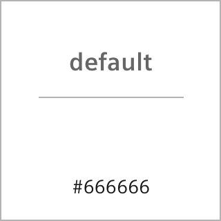
They are defined visual appearances during the interaction. The UI MarCom states concept defines five types of states for both light and dark theme:
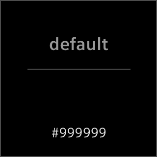
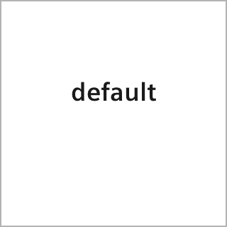
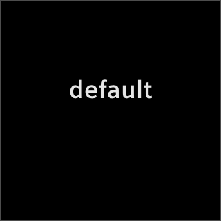
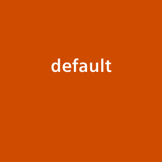
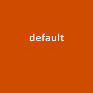
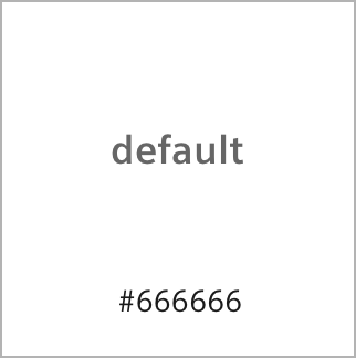
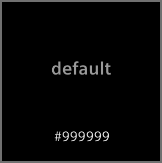
- Initial: shows the default status of a component while no interaction is being executed.
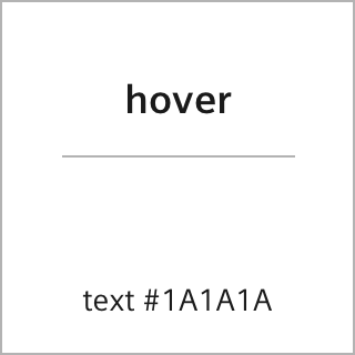
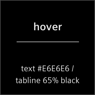
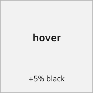
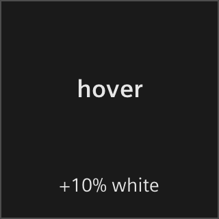
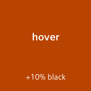
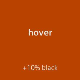
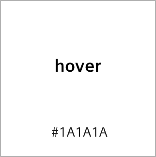
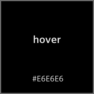
- Hover: shows the status when the cursor is placed over a component without activating or selecting it. The hover state is darker in light theme and brighter in dark them than the initial state, except for text- or icon in standard color which becomes orange in both themes.
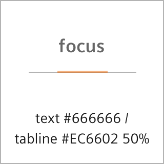
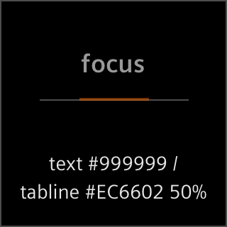
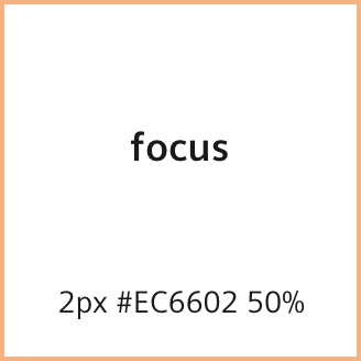
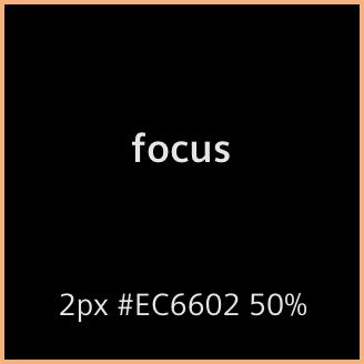
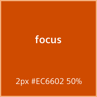
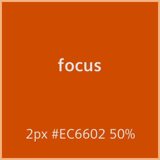
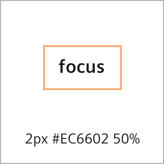
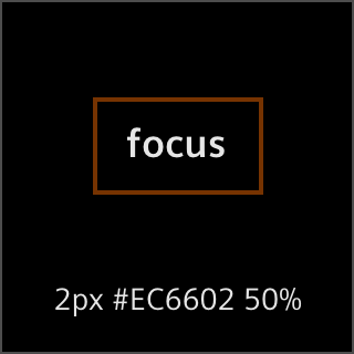
- Focus: shows the status when a component is emphasized e.g. using the keyboard. It turns up as a 2px border in 50% Healthy Orange.
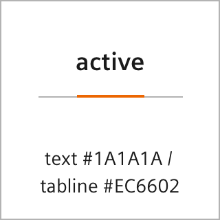
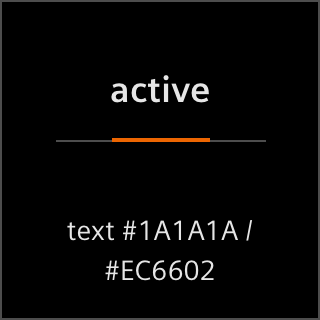
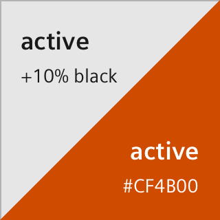
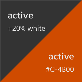
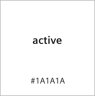
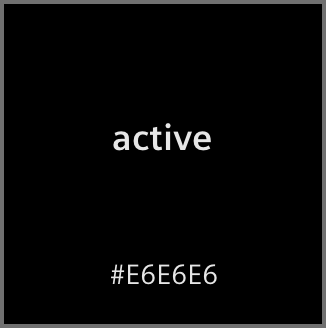
- Active: shows the state when a component is activated. It appears twice as dark as the hover state in light theme or rather bright in dark theme and it also can appear in orange in both themes – depending on size and importance.
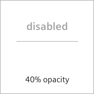
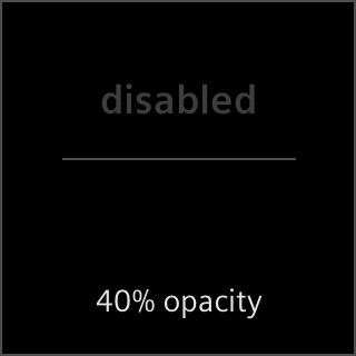
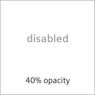
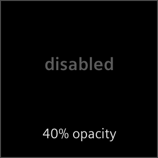
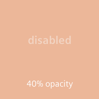
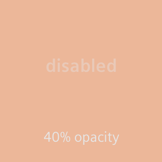
- Disabled: shows the status of a component that cannot be interacted with. Disabled components are displayed with 40% opacity.
The state indicator of a component is either the background color, the text- or icon color, or the tab line in the navigation. Based on this, the states concept is divided into four areas in which the states are defined accordingly.
Neutral colored background areas
The state indicator is a neutral background color in light or dark theme.
Brand colored background areas
The state indicator is the brand color Healthy Orange.
Strong neutral colored foreground items
The state indicator is the standard colored text- or icon in light or dark theme.


Restraint neutral colored foreground items
The state indicator is the grayed-out text- or icon color in light or dark theme – in navigation components supplemented by a tab line.
