Design
The design library provides a collection of reusable components to design mockups for websites and user interfaces. Using the library enables designers to use a single source of truth with consistent components in prototype and design work.
If you’re just starting out designing with UI MarCom, you’re in the right place. Here’s a checklist of everything you need to get up and running. Our Figma kit includes all the core components and styles for your reuse in your product and web experiences to create Siemens Healthineers compliant designs. By using the kit you will automatically receive updates made to the libraries ensuring your designs stay up to date with the latest release as well as ensuring consistency between design assets and code.
Up until version 3.2 we provided Sketch and Adobe XD. Whenever possible, we recommend using the Figma library, as it has a more advanced feature-rich set of components and support. You can read the components section to familiarize yourself with the existing components which you can incorporate into your designs.
Figma design library
Our primary UI design kit is built in Figma. Every element has been designed with the newest auto layout features, super-smart variations, and accessibility in mind.
Use the kit
You can view or download the UI MarCom components library on Bynder.
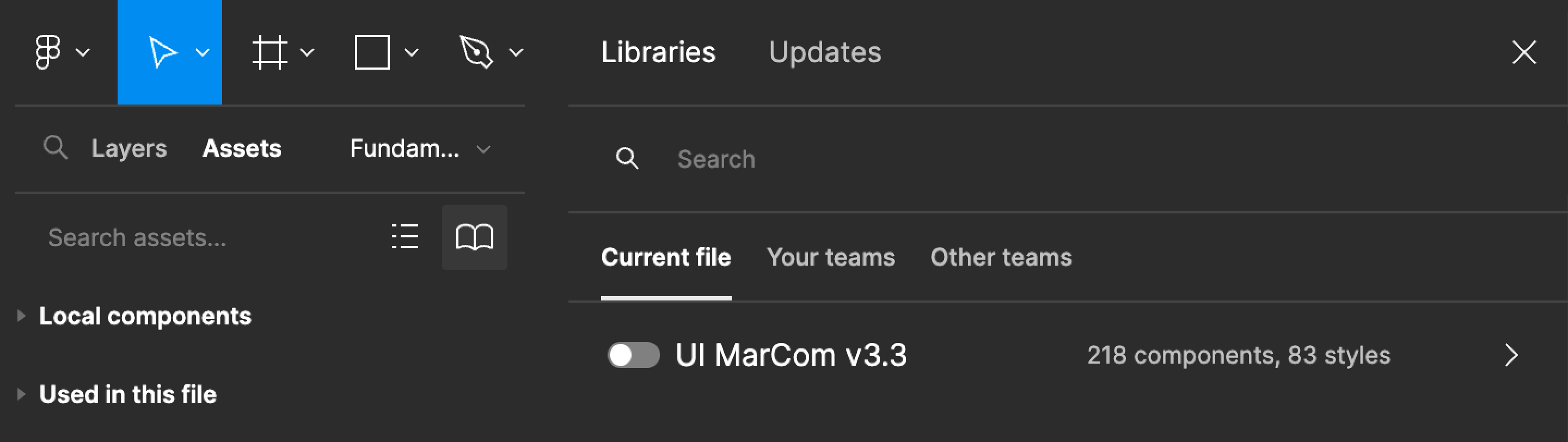
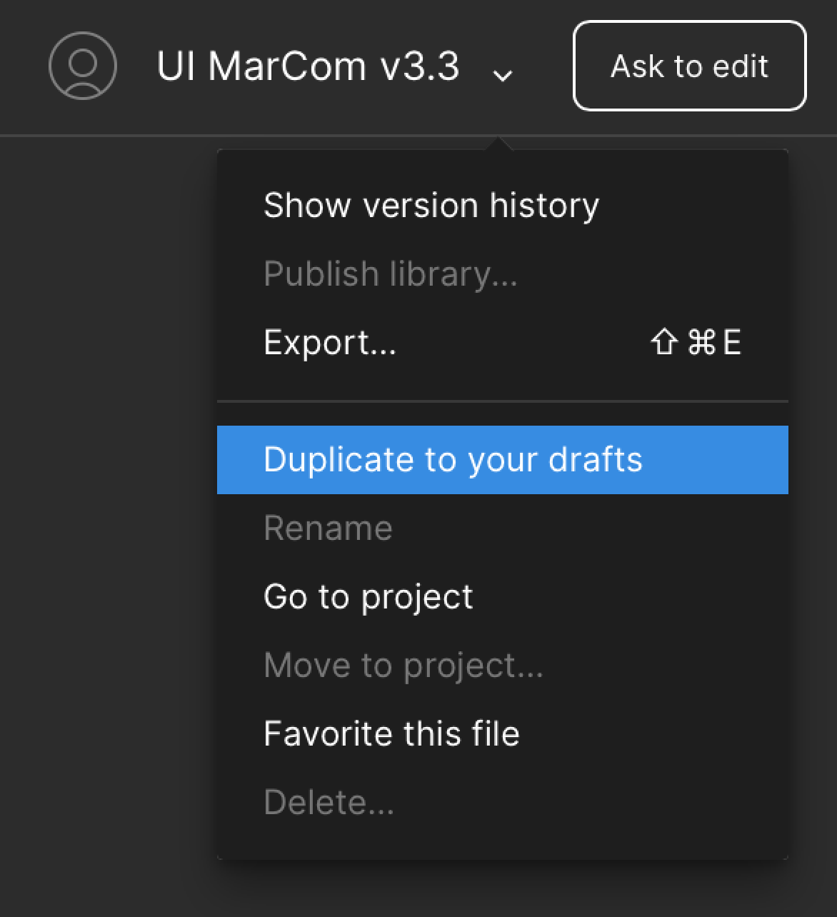
Duplicate the library to your drafts and activate the library through the book icon under assets.
To use assets directly in your draft you can click the book icon under “Assets” to make the UI-MarCom library components available in your file.
Changelog
You can find all updates to the design-files in the Update section.