Button Stable
Buttons attract users’ attention for actions. Different hierarchy levels of buttons are used to achieve the desired loudness level of attraction.
General guidance
There are mainly two types of buttons — standard and primary. The orange primary one is meant to be used for a singular call-to-action per page. Anywhere else the standard buttons should be used numerously.
Buttons can be used on all proper background colors and adapt their appearance automatically.
For the right usage of Buttons please be aware of the Interaction Concept.
The text label expresses the executed action. Keep it short and clear. If the text label does not suffice to communicate the performed action a supporting icon can be added. This should be an exceptional case. The right pointing angle is used exclusively to indicate a link to another page instead of triggering an action. It should only be used if a text link is not sufficient and it needs more visual importance. In all other cases use a Link.
Structure

- Contextual icon Optional
- Text label Mandatory
- Dropdown arrow Optional
- Background Optional (depending on type)
Standard button
The standard button with its reduced, neutral design is the most common button type. It is available in four versions:
- Button with label only (most common)
- Button with label and supporting icon
- Borderless button with label and supporting icon
- Control button
Primary button
The striking primary button is used for the primary call to action. It is used rarely – only for the main action. There are two types:
- Button with label only (most common)
- Button with label and supporting icon
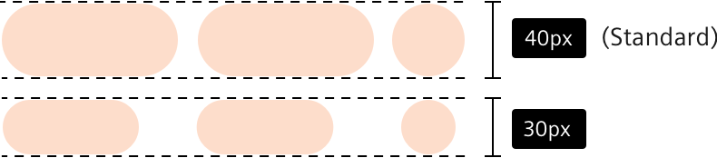
Button sizes
Buttons are provided in two sizes, the large one being standard. Use the small button only when the available space is an issue.
Button group
A button group is an optical consolidation of equally ranked standard buttons. The horizontal spacing between buttons should comply with the spacing concept and should so be 10px.
Dos and don’ts
- First define the goals of your website or feature. Use interaction elements in a hierarchy that supports your goals and prevents them from interfering with each other.
- Do not use two primary buttons side by side. The primary button should always be used with a button with lower hierarchy to focus the main action.
- Do not use long texts for button captions – keep them short and concise.
- Do not use textlinks with an encircled icon, only the arrow icon.
- Do not use outlined controls when they should be reticent. Think of the purpose of the control.
- Do not mistake links and actions. The correct type depends on the function of the button and should also be reflected by the wording and the icon.
- Do not misuse button groups as tabs.
- Do not use a contextual icon and a dropdown arrow in the same button.