Cards Stable New variant
Cards are versatile containers for the compact presentation of content.
General guidance
Cards fully utilize their advantages when used in clusters. By default, a Card spans the width of the parent container, such as the column of the grid. The card style can be applied to an anchor tag as well as a hyperlink on the whole card. A Versatile Card as a container doesn’t specify the content or the typography used. In contrast the Covered Card displays only specified content.
Versatile Card
Structure

- Content container Mandatory
Layout
Cards need to be put into a layout, which controls their width. Different ones may be suitable, but the choice depends on the desired result. The most commonly used card has the image on top of the content and represents therefore a basic card.
For individual demands Cards can optionally be adopted in different ways. Some modifications require the use of the Card modifiers listed below.
- Content: The content on the Cards is not prescribed at all.
- Hyperlinked: Cards can optionally act as a link to the teaser content.
- Images: Images can be used optionally and in different sizes.
- Color: All cards in one section use the same background color. A white background is standard. In gray sections it is also possible to use gray ones.
- Horizontal: In some cases, Cards with images can be displayed in a horizontal layout with the image on either or both sides.
Smaller cards
With small changes it is possible to tweak the card for a smaller footprint.
- With smaller font sizes for headlines and texts the content needs less space.
- With the help of the Aspect object the image can be set to a panorama format to reduce the height of the card.
Panel
A simple panel can be made by simply leaving off the image.
Rimless
Sometimes there is no need for the border around each card. This saves some space since the text on the card will have no extra padding. Different from standard cards the rimless card does not use elevation and differs in interaction behaviour.
Horizontal card
Cards with the image and text aligned horizontally should be used carefully with a certain control over their size and content. Nevertheless, there are some modifiers to control their layout. All modifiers mentioned above are also suitable for horizontal cards.
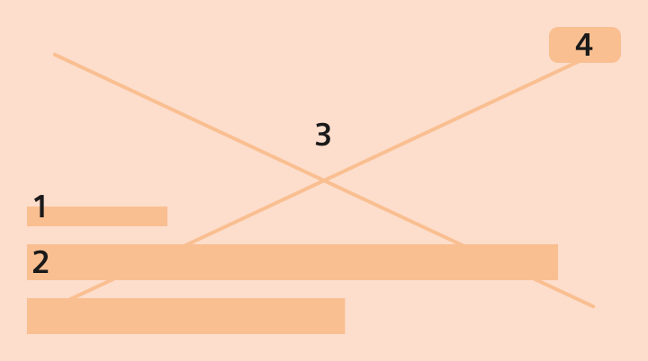
Image position on horizontal cards
The images on horizontal cards can be aligned left (default) or right. A horizontal card can stack the image to be a normal card below a specific breakpoint.
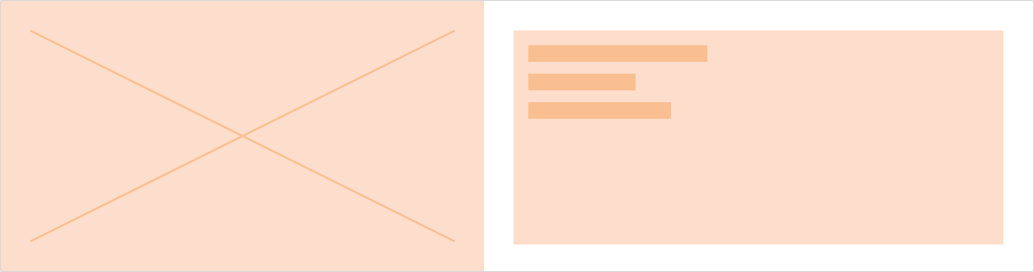
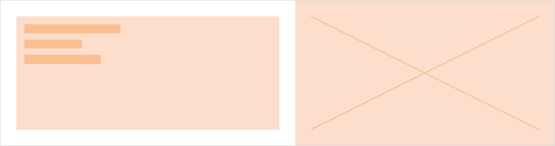
Image sizes on horizontal cards
The proportional width of the image relative to the text can be flexible or one of the pre-defined ratios. It defines the image compared to the width of the card.
There are the following modifiers available:
- flexible depending on content
- image set to 25% of card width
- image set to 33% of card width
- image set to 66% of card width
Covered Card
Structure
- Subtitle Optional
- Title Mandatory
- Image Mandatory
- Label Optional
For highlighting cards and teasing content in an emotional way, use the covered card. In this special case the content sits above the image that fills the card. In addition to the title an optional subtitle and label with specific information and icon indicator can be added. Using the covered card saves space, but keep in mind, that the amount and type of displayed content is limited. It has to be simple and short.
Dos and don’ts
- Cards are useful in groups to show content in the same way. Single cards as standalone elements are useless.
- Do use the same image size for Cards that are clustered.
- Do use a small card with reduced padding if a tiny font size is used.
- Do not use long text on cards. They will get very tall otherwise.