Navigation bar Stable Dark theme
The Navigation Bar is the part of the Header that contains the global navigation.
General guidance
The Navigation Bar shows up in the Header below the Application Bar. If required it can optionally include an extra interaction element on the right edge. This might be a button for an overall primary action that needs to be performable from any page.

Structure

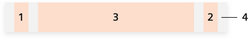
- Navigation elements Mandatory
- Interaction element Optional
- App identifier Mandatory
- Background Two versions (light, dark)
Dark and light theme
The Navigation Bar is available in a dark and light version – depending on the use case. The dark version is used for marketing, the light version for application purposes.
Navigation Bar and Footer are strongly related to each other. The Footer is available in two versions as well. Both Navigation Bar and Footer have to use the same theme and match in color. A light Navigation Bar requires a light Footer. A dark Navigation Bar is coupled with a dark Footer.
Dos and don’ts
- Do not use the light Navigation Bar with the dark Footer. They always have to use the same style.
- Only use the button on the right edge in exceptional cases.
- Do not include a Navigation Bar for a single menu item.
- Do not add too many first level navigation items with long terms. Extensive navigations are shown in an off-canvas-menu when space is limited.