Textfield Stable Dark theme
Textfields are form inputs that let the user enter terms of text.
General Guidance
Textfields like other form inputs work well on light and dark background. To make multiple lines of input possible a textarea is also available.
Structure
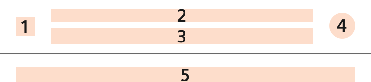
- Icon Optional
- Label Mandatory
- Input text Mandatory
- Indicator Optional
- Helping information Optional
States
For a single line of text use the inputs with an appropriate type attribute.
Textarea
Textarea works like a Textfield, but offers the possibility to display multiline text, e.g. in forms where the user should add longer free text. It resizes vertically as the text gets longer.
Dos and don’ts
- Do separate long forms into sections for a better overview.
- Do keep label text short.
- Do provide understandable hints below or perceptive placeholder text.