Spacing
With the defined spacing system, we ensure to improve readability and consistency across all pages.
All components align to a 10px square baseline grid for mobile, tablet, and desktop. Elements and components like iconography and typography, align to a 5px baseline grid and all spacing and component sizes are based on increments of these 5px. With that in mind, the spacing system is based on a 10point soft grid system defined by the line-height of our base font-size to ensure consistent sizing, spacing, alignment throughout the system.
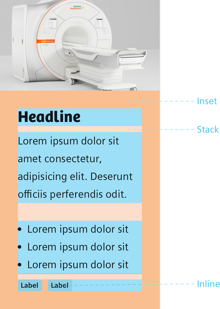
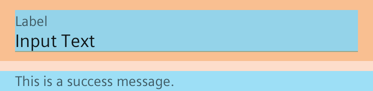
A spacing scale is used for smaller, more refined spacing needs, specifically within the context of a component (i.e. the space between a label and a text input). There are three spacing rules and spacing values, that work well with the typographic system.
Rule for Containers
- Uniform inset spacing inside all containers in our UI.
Rule for Content
- Content is stacked vertically. There are defined header stacks for headlines with margin values that work consistently across all headers. Leaf-node stacks are addressing spacing needs for paragraphs, lists, forms, tables.
Rule for Components
- Uniform inline spacing for all adjacent components in our UI.
- Make exceptions with smaller spacing only for components that are associated together.