Develop
The library provides front-end developers & engineers a collection of reusable HTML and SCSS partials to build websites and user interfaces. Adopting the library enables developers to use consistent markup, styles, and behavior in prototype and production work.
Browser Support
The current version of UI MarCom supports the following platforms and browsers
 Chrome Chrome | Supported Latest 2 versions |
 Firefox Firefox | Supported Latest 2 versions |
 Edge Edge | Supported Latest 2 versions |
 Internet Explorer Internet Explorer | No nativ support Needs web components polyfills. |
 Safari Safari | Supported Latest 2 versions |
| Chrome Android | Supported Latest 2 versions |
| Safari iOS | Supported Latest 2 versions |
Install
UI MarCom is hosted on Azure DevOps and can be installed as an npm package into your project. Since it is not listed in the public npm registry you need to request it via our private registry.
Announce private registry for desired version
To gain access to the UI MarCom npm package you have to put the correct npmrc file into your project. This file will resolve our @shs name space to the hosting server. But beforehand you have to choose the version you need in your project.
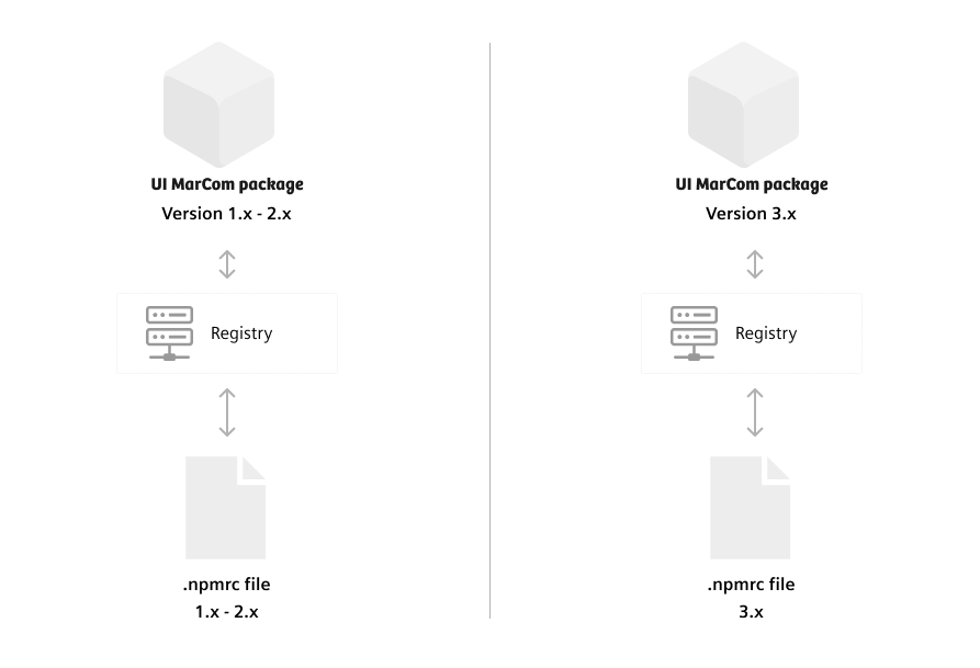
Due to a technology shift UI MarCom 3.0 and up is hosted separately. To install version 3.x you need the npmrc file that points to version 3.x. The prior versions 1.x – 2.x can be installed with the old npmrc file that points to the repository with these versions. If you intend to update from UI MarCom 2.x it’s not enough to change the version. So get the new npmrc file first.
It is not possible to install UI MarCom 3.x web components with the old npmrc file that has been used to install version 2.x
You can get the npmrc file by simply writing an email to ui-marcom.team@siemens-healthineers.com.
Install package
After putting the correct npmrc file into your project root, run the install command to include UI MarCom in your project.
$ npm install --save @shs/ui-marcomAvailable versions are depending on the present npmrc file in your project root
Javascript
1. Importing components
After you’ve installed UI MarCom through npm, you can grab necessary components like following:
import "../node_modules/@shs/ui-marcom/src/js/tag.js";2. Using the components
You can use the components by simply putting a given custom tag into your html. Note: Some of the components may need some attributes.
<uimc-tag selected>Description</uimc-tag>Modular SCSS styles
Alongside with our encapsulated Web Components introduced in Version 3.0, it is still possible to include the modular styles known from Version 2.
Our Sass files are organized in seperate folders to comply with the architecture of Inverted Triangle CSS (ITCSS). Our components follow the BEM naming conventions and treated as blocks though. Elements within the components are separated by double underscores .component__element and modifiers are postfixed with a double dash .component--modifier.
Using the UI MarCom Sass files infers usage of the SCSS pre-processor. All Sass files use the *.scss file extension. For transpiling Sass code, use node-sass based Sass compilers, for example, WebPack sass-loader or gulp-sass.
It is advisable to include the UI MarCom Sass folder into the path of your Sass compiler in addition to the projects SCSS sources.
includePaths: [
  'node_modules/@shs/ui-marcom/src/scss/',
  'src/scss/'
]
This allows imports without further path specifications.
@import "settings";
@import "tools";
@import "elements/button";
@import "components/button";
Default element styles
CSS includes generic styles like browser resets and set common styles on basic HTML elements. These styles are generally applied and may be overridden by adding a component class name.
Importing SCSS files
By using the Sass files in your project, you are able to control whether a component is transpiled into CSS or not. Each single component needs to be imported first, which do not result in any CSS output. You can leverage the cumulated Sass files with all imports by simply importing it to your projects SCSS.
@import "/node_modules/@shs/ui‑marcom/scss/ui-marcom.scss";
@import "ui-marcom";| Layer | settings.scss | tools.scss | ui‑marcom.scss |
|---|---|---|---|
| Setting variables | ✓ | – | ✓ |
| Tools functions & mixins | – | ✓ | ✓ |
| Component mixins (Generic, Elements, Objects, Components, Utilities) | – | – | ✓ |
| Transpiled CSS (Generic, Elements, Objects, Components, Utilities) | – | – | – |
Importing the whole ui‑marcom.scss only provides the full possibilities and doesn't transpile a huge CSS file
Transpiling CSS
Only transpiled CSS makes class based styling possible. To include desired components in your application CSS you have to call each render mixin. The component mixins are available through the previously performed import.
// example includes
@include sh-grid();
@include sh-button-group();
@include sh-u-margin();
It is reccommended to create your project-specific, to not load all the components you’ll never use. Your application Sass file should be a cherry-pick of the styles you need – to do this, comment out dispensible includes from your copy of the main.sass file.
| Layer | main.scss |
|---|---|
| Setting variables | ✓ |
| Tools functions & mixins | ✓ |
| Component mixins (Generic, Elements, Objects, Components, Utilities) | ✓ |
| Transpiled CSS (Generic, Elements, Objects, Components, Utilities) | ✓ |
There is no need to include styles for Web Components, since they handle their own scoped CSS
Extending and customizing a style component
The render mixin empowers developers to easily customize Sass components.
1. Set option parameters:
@include sh-card((
  bottom-margin: 20px
));
On some parameters you are able to override the setted default values to change the appearance of the component.
2. Add custom styles:
@include sh-card() {
  padding: 10px;

  &__title {
    margin: 0;
  }
};
When injecting additional styles into the component, you are able to use the nesting ampersands and private functions of the component.
3. Override styles:
.#{$prefix}card() {
  padding: 10px;
};
This might be the old-fashened way: simply overrule the component styles with your own afterwards.
Namespacing
Most of the UI MarCom Components are prepared for prefixing class names. The global SCSS variable $prefix is prepended to any class selector. It is empty by default but can be specified to your own purpose. Just change the mentioned SCSS variable to e.g. ui- before including the render mixins of component.
@import "objects/card";
$prefix: "uimarcom-";
@include sh-card();
This avoids name collisions if you need to handle style components of different origins and prevents accidental overwriting of existing styles.
<div class="uimarcom-card card"></div>SCSS variables
UI MarCom is build upon a bunch of Sass variables, which can be used in custom stylesheets as well. The use of predefined variables ensures consistency over all styles based on it. It also enables you to set values once, which than cutomizes your whole application.
$sh-base-font-size: 18px;
$sh-grid: (
  max-widths: (
    sm: 30em,     // 540px
    md: 40em,     // 720px
    lg: 53.333em, // 960px
    xl: 80em      // 1440px
  ),
  gutter-width: 1.666666666rem // 30px
);If you’d like to use the UI MarCom settings in your own styles, do not call the variables directly. All stored settings can be retrieved easily by calling the likely named function:
$margin: sh-grid("gutter-width");
color: sh-color("orange");
font-size: sh-font-size("xlarge");Alternativly most of them are also available as mixins:
@include sh-color("orange");
@include sh-font-size("xlarge")If you’d like to know which variables are available you can find all files in the ‘settings’ folder of the installed UI MarCom: node_modules\@shs\ui-marcom\scss\settings
Helper-classes
UI MarCom comes up with some utility classes. Actually these classes follow the single-responsibility-priciple and do exactly what they are named for. Most of them are named similar to the well known CSS properties. As an excerpt the most useful utilities are:
| Utility class name | Responsibility |
|---|---|
margin-[top/bottom/left/right]-[1…4] | Set margin as a multiple of the gutter size |
padding-[top/bottom/left/right]-[1…4] | Set padding as a multiple of the gutter size |
display-[flex/block/inline] | Override display property |
position-[static/relative/absolute/fixed/sticky] | Override position property |
hidden/show-[sm/md/lg/xl]-up/down | Show or hides elements responsive to the viewport |
text-decoration-[none/underlined/line-through] | Changes text decoration |
text-align[left/right/center/justify] | Set alignment of text and inline elements |
Note that only included styles can affect the outcome of your HTML. Including all utility classes will bloat your resulting CSS. In production work it is recommended to only include the needed CSS. It is quite different with the @import rules. As they don´t result in transpiled CSS they can be imported completely with the help of the assembled ui-marcom.scss file. To get an idea of the possibilities, look at the list of imports in this file or comment them out in your copy of our main.scss file.
@include sh-u-flex();Including all utility classes will bloat your resulting CSS. In production work it is recommended to only include the needed CSS.
Icons
Some components depend on icons from the UI MarCom icon set. You can use any of them for appropriate purposes. Read the docs for details on how to use them.
Autoprefixer
Our SCSS sources contain only native code due to maintainance and readability. For wide x-browser support make sure your build process uses autoprefixer to ensure vendor prefixes are automatically added to your output CSS. Autoprefixer can be added as a PostCSS plugin.
SCSS within Web Components
Web Components do not have native support for Sassy CSS. To leverage our modular Scss within Web Components a transpiler (source-to-source-compiler) is necessary to transpile the code during the build-process into a CSS file.
As every web component needs a small excerpt of styles, we prepared some Sass files that resolve the style dependencies for each component in the subfolder scss/webcomponents. Just like we use them in each of our components, you can import styles from these files into your own Web Components. Of course, it is also possible to extend and customize the styles of a Sass component in the way described above.
Due to Web Components are rendered inside a shadow DOM only the explicitly imported styles are working on elements of this Web Component.
It is not possible to apply utility classes to custom elements.
Web Fonts
The web font files are included as assets in the UI-MarCom NPM package.
Do not download the font files manually from another source. The compatibility and a seamless implementation of the UI-MarCom styles can only be guaranteed with the included font files.
Use web fonts in your project
After installing UI-MarCom as a dependency simply link to the stylesheet that defines the @font-face rules.
<!-- SH web fonts -->
<link rel="stylesheet" href="node_modules/@shs/ui-marcom/assets/fonts/webfonts/webfonts.css">
This straightforward method does not automatically put the assets in your build distribution folder. To do so, you have to copy the webfonts folder into the assets of your project and load the CSS file from there.
International font subsets
The SH-Bree Headline web fonts support multiple languages for international use. Due to loading performance the font is separated into subsets. The browser will load them as needed to render the glyphs in the text.
| Charset | Web Font Subset |
|---|---|
| Basic Latin, Cyrillic and Greek | 121kB woff2 file |
| Middle East | 150kB additional woff2 file |
| Thai | 134kB additional woff2 file |
| Chinese, Japanese, Korean | To large to provide as web font |
| Other glyphs | No web font files available |
The Siemens Sans web font supports extendet latin charset. There are no special character subsets available. Since it is used for all types of copy text, it is separated into seperate files for eache font style instead.
Fallbacks for none supported languages
For unsupported glyphs a suitable fallback font will be used to render the font. These fallbacks are defined as font stacks in the UI-MarCom styles.
Chinese, Japanese, Korean character sets are far to big to be loaded over the internet. Therefore all online applications are recommended to rely on the system fallback fonts.
If the fonts are installed on a users computer, these local files will be used to render the text. This saves valuable bandwith and makes the web application load faster.