Alerts Stable Updated Dark Theme
Alerts are notifications that attract the user’s attention. They can be directly related to an interactive process and give the user feedback on the success or failure of an action.
General guidance
Alerts can display successes, warnings or errors. The content can be supported by a status icon. Alerts do not block user interactions with the content. Apart from modal dialogs, Alerts only provide information and do not need any mandatory user interaction to continue. But when the user interacts with them, they will disappear.
Structure
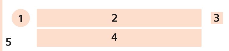
- State indicator Optional, can be used to give the user a better understanding about the intention of the message
- Title Mandatory
- Close icon Mandatory, closes the alert box
- Content container Optional
- State indication bar Optional, to emphasize the state indicator
Types (Info, Success, Warning, Error)
- An info message can be used to show information that is neither intended to indicate errors nor to show progress, but nevertheless contains information that is relevant for the user.
- A success message informs the user about the successfully completed action. Use this message type selectively for critical actions only. It is recommended to avoid such message if the success is visible by the direct change of the related element, or consider showing micro feedback like a success badge.
- A warning message informs the user about a critical situation or condition that might cause a problem in the future. It informs the user about possible negative consequences of his/her actions
- An error message informs the user about a problem, a failure, a critical situation or a critical condition that has already ocurred. It contains guidance to solve the problem
Dos and don’ts
- Do not use Alerts when you need a decision by the user. Use Modal Dialogs in that case.
- Do not use status icons if it is not clear whether the message is positive or negative.