Eyecatcher Stable New in 3.1 Dark theme
The eye catcher is a component used on pictures to highlight something new or special.
General guidance
The Eyecatcher, is as it‘s name implies, a flag to catch visual attention by design. It‘s designed to grab attention for a product or topic that is either new or something in a similar fashion.
Placement

Structure
The Eyecatcher comes in two different variations in terms of it‘s structure. They differ in size of the font. One is restricted to one row of text and 3 letters. The other one leaves space up to 7 letters each of the 3 rows.


- 1 row up to 3 letters
- 3 rows up to 7 letters
Types
These are the basic color options used on different backgrounds. There is no orange version. We don‘t want to compete with interaction patterns, that often use orange as primary color for interaction. For reference see Interaction

with 1 row

with 3 rows

with 1 row

with 3 rows

with 1 row

with 3 rows
Examples
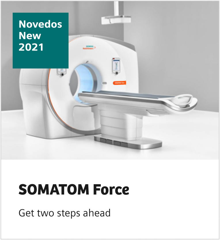


Dos and don’ts
- Our design is reduced and excessive use of eye-catchers should be avoided.
- Avoid long words.
- Make sure to communicate all information by using a headline, subhead, or body text.
- Only use eye-catchers in exceptional cases, for example, product announcements, events, and awards.
- Don’t capitalize words.
- There is no Healthy-Orange version. We don‘t want to compete with interaction patterns.
- Don’t allow the eye-catcher to compete with the logo.
- Don’t use more than one eye-catcher in one component.
- Don’t cover the faces on key-visuals with the eye-catcher.
Related components
They are often used on images on cards, or on the stage- or hero-block component
