Modal Dialog Stable
Modal dialogs are used for processes that need a decision by the user. They are shown with a layer above the site content.
General guidance
Modal dialogs focus the attention of the user to the dialogs’ concern. A specific user interaction is required to continue on the site behind it that is covered by a fog. Once the user has completed the task, the Modal Dialog closes and the result of the decision is shown on the main page or in Alerts. Modal dialogs contain a title bar, a content container and a bottom bar. The content container can also contain longer scrollable content like forms. The title and bottom bar are always visible. On the bottom edge of the modal dialog one or more buttons offer the opportunities to the user.
Structure
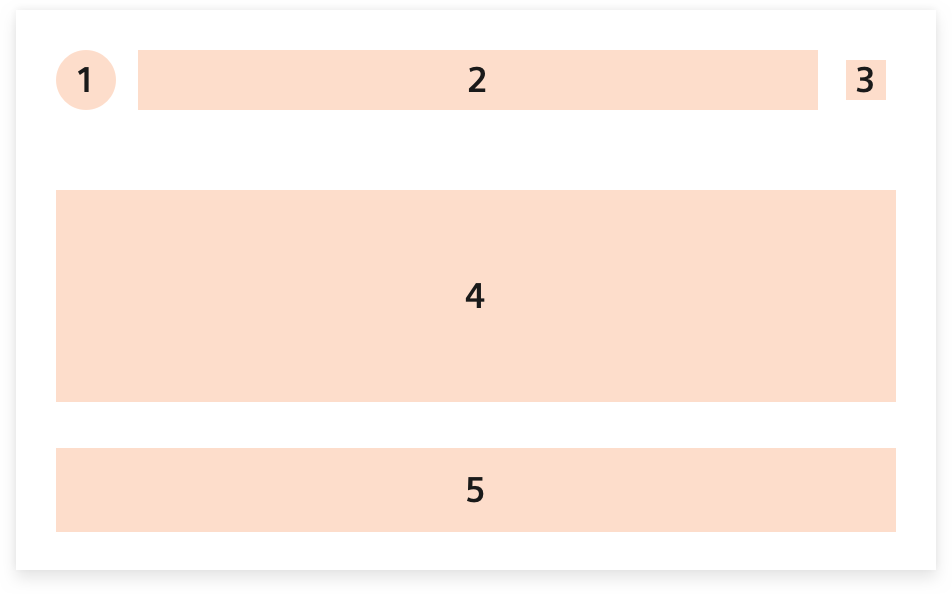
- State indicator Optional
- Title Optional
- Close icon Optional
- Content container Mandatory
- Bottom bar Mandatory
Modal dialogs should not be informative only. A user interaction is required to continue on the covered site behind it.
Therefore, take note of this advice to continue…
Related components
To not have it modal and only informative, have a look at related components like Overlays and Alerts.
Dos and don’ts
- Do not overload the dialog with content. Focus on the essential.
- Do not use a modal dialog if it is not necessary. It interrupts the user, so use it sparingly.
- Do not use a modal in a modal. Dialogs are not supposed to be nested.
- Do not use a mistakable title. Keep it clearly and short.
- Do not use unpredictable button names. Buttons have to explain what will happen when they are used.