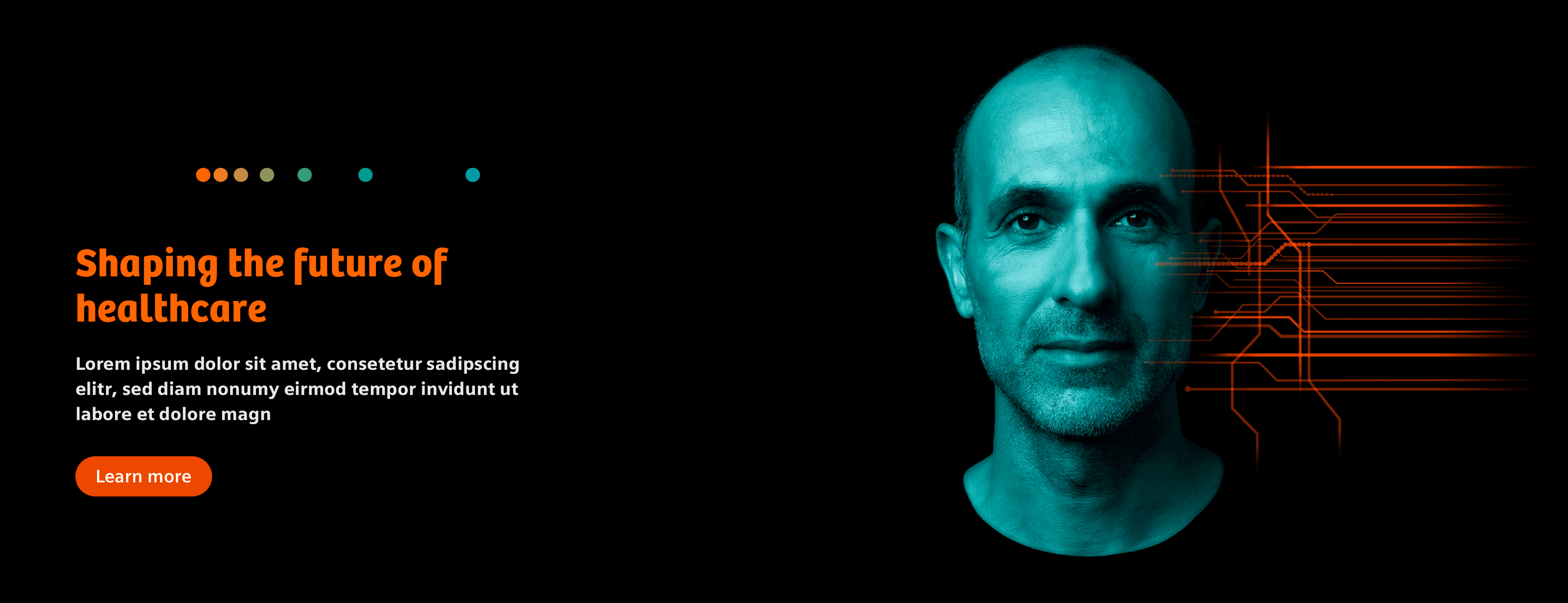
Stage Stable Dark theme
A stage is used for a conspicuous entrance, for example on the website. It is recommended for displaying one or more campaign visuals and claims on top of the content.
General guidance
There are two types of the Stage available. The dark version including the key visual has a strong brand character. The light version is used with editorial images.
Stage
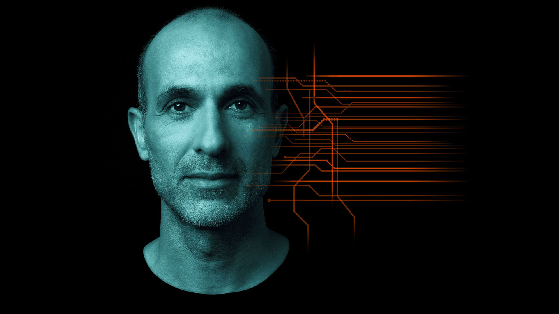

Covered Stage
Added in 3.1
The covered stage comes with a gradient image and is also available in dark and light and can be called directly in the component tag via the ‘covered’ attribute.


The Covered Stage is intended to be used with the black version for dark imagery and intended to be used with the white version for images with an overall light tone.
Structure
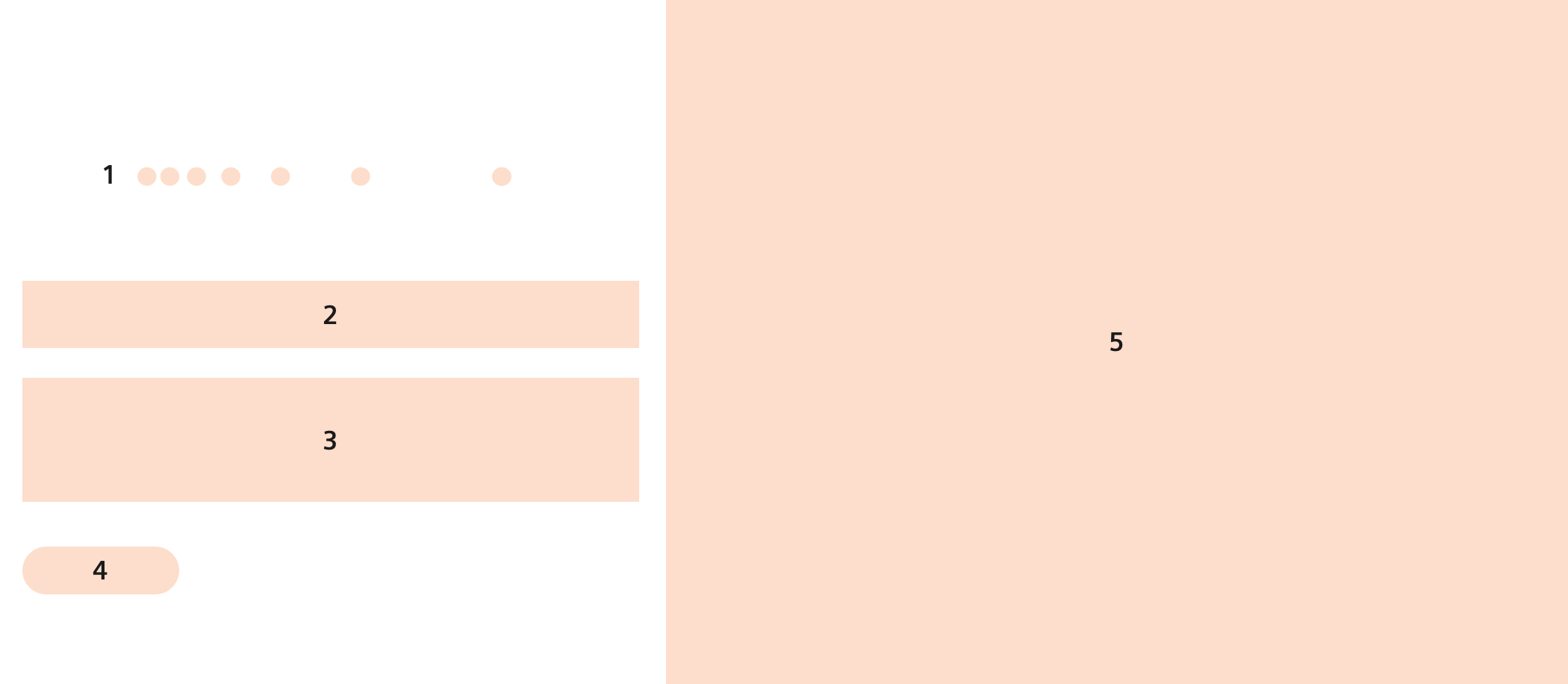
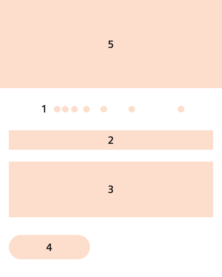
- Dot pulse Mandatory
- Headline Mandatory
- Subheadline Optional
- Button area Optional
- Image Mandatory